FPResearch provides portfolios, market health gauges, and sector signals derived from purely mechanical models and traded using ETFs and mutual funds. Our market indicators and sector signals provide investors and advisors a method for creating their own portfolios and/or modifying one of our existing portfolios.Portfolios DashboardThe portfolios are built around a variation on a core-satellite theme. We hold a relatively static low-volatility set of portfolio positions to comprise the Core. Depending on the portfolio, these Core positions will be either equity positions in healthcare and consumer staples or bond fund positions in global and high yield bonds. Next to this Core, we trade "satellite" positions in emerging market and domestic equity ETFs to capture intermediate trends. These satellite positions can be either long or short depending on the market's trend. The purpose of these positions is to drive performance. The more active trading approach minimizes exposure to more severe market movements against us. This low volatility Core combined with a higher-performance Satellite provides us with steady returns in any market environment with drawdowns that are a small fraction of the typical stock or stock-bond balanced portfolio. Implementation of our portfolios could not be easier. We tell you when to trade before the market open with an average of only 1-2 trades per month. Trade frequency can be much greater during periods of high volatility as our models seek to protect us on the one hand, while giving us the opportunity to quickly get in on whatever the next trend will be. Our website displays the current signals at all times for you. In addition, you will receive email notification of any signal changes. You are typically only managing 2-4 positions making the trading burden very manageable. 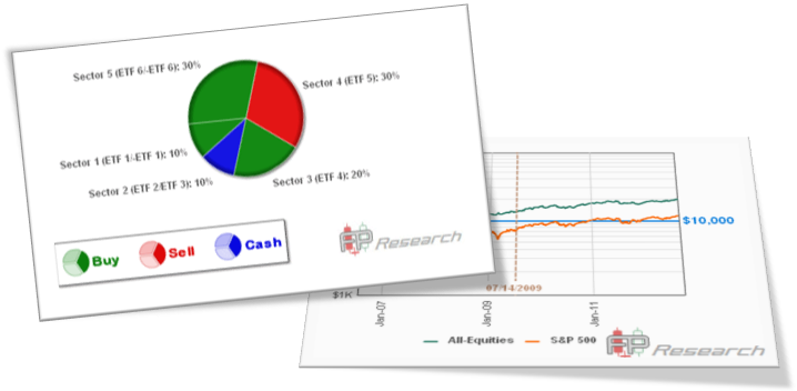 Broad Market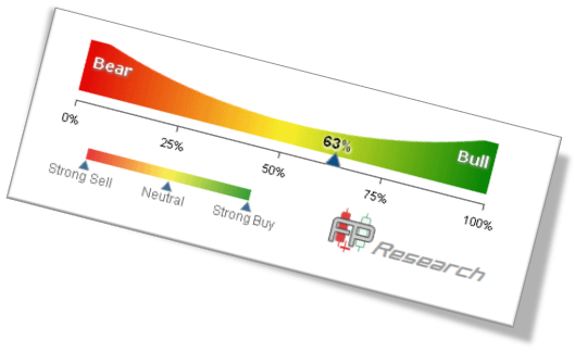 Our Broad Market Trend Indicators offer both a long-term and intermediate-term view of the market. Taken from over a dozen separate models and indicators, our Broad Market Trend Indicators provide a very accurate view of the market's temperature. Investors who prefer to follow the market's trend with their purchases can use this simple market temperature gauge to know when the market is giving the "all clear" signal or whether risk is becoming higher for new purchases. Similarly, if investors like to hedge their portfolios, or want a visual cue when to take some profit, our broad market gauges offer that cue by alerting subscribers to weakening market conditions. The FPResearch Broad Market Trend Indicator provides us a quick picture of market health. Using over a dozen inputs, we generate a picture of the intermediate (weeks-long) and long-term (months-long) trend of the market. We use a simple color-coded graphic to depict the status as shown below. 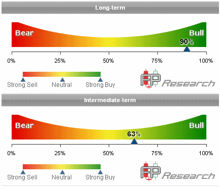 Reading the graphic, the right "bullish" side tells us there is some form of market uptrend in place. The left "bearish" side notes a downward trend. When the graphic is between 25% and 75%, we are receiving mixed signals, with some inputs taking a Cash position; thus, a cautious approach to taking new positions is advised. The inputs are mostly trend-following in nature. There are no "contrarian" or mean-reversion inputs influencing our broad-market reading. Some portfolios hold a large broad market stock position, such as the VTI. If you have such a position as a core holding in your portfolio, you could use our Broad Market Indicator to manage that position - over the intermediate or long term (or both). Readings above 75% or below 25% are solidly in the bullish or bearish camp and would be fully invested accordingly. We also want to understand which direction the level is moving. The emails you receive when the Broad Market Trend Indicator changes will indicate the shift (for example, from 90% to 80%). You want to notice the direction of that shift. Is the trend becoming stronger or weaker? In the end, our broad market trend indicator gives you another layer of understanding what is going on in the market without having to spend time reviewing lots of charts or subscribing to many newsletters and/or signal providers. We aggregate all of that for you into one clean indicator of the market trend. Sectors Dashboard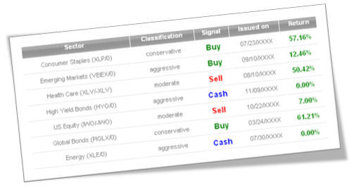 Our Sector Signal Dashboard helps investors build their own signal-driven strategies. With a range of sectors - from defensive to cyclical, stock to bond - subscribers can customize their portfolios using the sectors they choose to create portfolios that are more or less aggressive. Clicking on the sector name brings up detailed metrics about the signal - its return history, maximum drawdown, etc. Pairing these individual sector signals with our steady, consistent return portfolios gives you the flexibility to make each portfolio your own, fitting your objectives and risk tolerance.
Building your own portfolios by combining individual sector signals and/or adding individual sectors to our existing portfolios is easy to visualize with our Building your own portfolios by combining individual sector signals and/or adding individual sectors to our existing portfolios is easy to visualize with our risk-return matrix and correlation table. Our risk-return matrix displays a color-coded map of risk and return for our sectors with red and orange Quadrants 3 and 4 denoting higher risk/higher return sectors and blue Quadrant 2 showing lower risk/lesser return choices. Adding choices from the blue Quadrant 2 will generally reduce risk. Adding choices from red/orange Quadrants 3/4 will increase risk and hopefully return. Our two model portfolios - All-Equity and Equity-Income - are built in this way, an optimized mix of choices from these quadrants. and correlation table. Care to reduce risk by adding a less correlated sector? Our correlation table guides you to which sector to add. Concerned about the market and want to reduce your portfolio volatility? Our risk-return matrix offers lower volatility choices to find a solution that fits your needs.  Our risk-return matrix offers a visual way to see how our signals improve your performance. The goal is to reduce risk and/or enhance return. In the color-coded matrix, we have four quadrants with the reddish-colored Quadrants 3 and 4 being the land of high risk, in the form of more volatility. Sectors such as emerging markets, energy, small-cap, and Nasdaq stocks live in these quadrants. The blue-green Quadrants 1 and 2 provide low volatility choices. This is where we find our core holdings of consumer staples, healthcare, and bonds. The light blue Quadrant 1 is the goal; that's where we want to live. Quadrant 1 delivers a +12% annual return with volatility that is very tolerable for most investors. We want to pair the Quadrant 3 and 4 sectors with those from Quadrant 2 to create a portfolio that lives in Quadrant 1. Both of our portfolios, Equity-Income as well as All-Equity, meet this goal.
We also want to build signals that improve upon the base buy-and-hold performance of the sector. We show this in our matrix by moving left to a lower risk level and/or up to a higher return level. Being able to push from one of the reddish quadrants into one of the blue-green quadrants is an even better result. In summary, the reddish hues denote higher risk; the blue-green offers lower risk. We want to combine sectors and assets in such a way that we get results in Quadrant 1. Our model portfolios achieve that objective. But there are certainly other ways to get there and you may find one that performs better than our models! CustomizeOur Customize page allows you to create customized portfolios that best serve you and your client's needs using the FPResearch Risk-Return Matrix and Sector Correlation Table. Building your own portfolios by combining individual sector signals and/or adding individual sectors to our existing portfolios is easy to visualize with our risk-return matrix and correlation table. Our risk-return matrix displays a color-coded map of sector risk and return with our proprietary signals applied. Red and orange Quadrants 3 and 4 denote higher risk/higher return sectors with blue Quadrant 2 showing lower risk/lesser return choices. Adding choices from the blue Quadrant 2 will generally reduce risk. Adding choices from red/orange Quadrants 3/4 will increase risk and hopefully return. Our two model portfolios - All-Equity and Equity-Income - are built in this way, an optimized mix of choices from these quadrants that provides very low risk while achieving consistently solid returns.We can add another layer of sophistication to this process by using our correlation table as a reference. The correlation table is color-coded to match the risk-return matrix, with the higher risk/return sectors shaded red/orange and the lower risk/return sectors shaded blue. The numbers in the table reflect the correlation of returns between the various sectors, with a correlation of 1.0 being perfectly positively correlated and -1.0 perfectly negatively correlated. Portfolio theory teaches us that adding investments that are relatively uncorrelated can improve returns while also diminishing risk.
Looking at the correlation table, we see that Ticks 3 and 5 have a very low correlation with Tick 7 (0.00 and -0.07, respectively). Thus, if we own Tick 7 as a sector, adding Tick 3 and/or Tick 5 will add no risk to our portfolio, and will likely DECREASE RISK. Conversely, adding Tick 6 to a portfolio of Tick 7 may increase our return, but it will not change our portfolio risk very much as the correlation is a POSITIVE 0.36, which is quite high in our world. (Note that all the correlations shown reflect using our proprietary FPResearch signals. Without our signals, the correlations would be much higher in most cases.) Our model portfolios combine very low correlation sectors in order to give you portfolios with the least amount of risk while offering consistently solid returns. The correlations of our "core" holdings are very low with our high-beta/performance holdings of emerging market stocks and U.S. stocks. The very low correlation means putting these core holdings together with these high-beta sectors gives us good returns with LESS risk. It gives us a portfolio that lives in Quadrant 1 of our risk-return matrix - better return with less risk than ANY of our sectors by themselves. The combination is better than the sum of its parts. Using our correlation table and risk-return matrix can help you create portfolios that best serve you and your client's needs. Here are a couple of workable examples for how you can do that: Example 1: Become more aggressive in an uptrending market ("upshift" to a higher gear)
FPResearch gives you the tools to easily manage your money and/or your client's assets. Our portfolios minimize risk while offering solid returns. Use our individual sector signals to customize your portfolio. Our broad market trend indicators give you an overall weather vane to help keep tabs on market health. You will never again be victimized by a ferocious bear market, nor see your client assets decimated by a financial crisis. Our signals have a solid history of side-stepping the major damage from such events to keep your portfolios running positive and you and your clients sleeping well. Finally, we are always here to help answer your questions, provide suggestions, and generally help you maximize the value of the tools and information we provide. FPResearch is your one-stop guide to easy, profitable portfolio construction. Less Risk, More Return that's FPResearch. |
|
|

